Have you ever wish to have a easy-to-use app for your museum visit?
ArtStory is an app that focusing on creating an experiences of visiting museum/gallery for all people. While having a function to reserve ticket, it also serves as a way for people to know which museum/gallery that accommodate disabilities. This project is a part of portfolio project from Google UX Design Professional Certificate from Coursera.
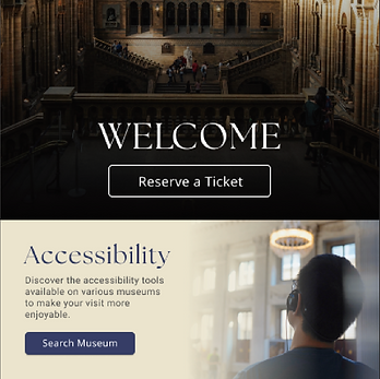
Copyright: All photos are reserved to each photographer @ unsplash.com. Museum name and photos might not accurately represented (dummy purpose).
Problems
-
People having hard time to enjoying museum due to lack of information.
-
People with disability need a way to enjoy museum better, particularly to learn about Art History and Exhibition information.
Tools
-
Figma
-
Adobe Illustrator
-
Microsoft Powerpoint
-
Microsoft Word
Team
-
1 UX Designer
Solutions
-
Creating a mobile app to help people navigating inside museum/art gallery.
-
Help user to immerse better in their visiting experiences by attending to specific needs for sight and hearing disability. In the future, additional features could also be implemented on this application to help other specific disabilities.
My Role
-
UX Generalist (User Research, define problem and solution, creating wireframe and prototype of the app)
Timeline
-
Overall: 1+ month
-
Discovery & Research: 1 week
-
Design & testing: 3 weeks
The Design Process
1
Discover
2
3
4
Define
Ideate
Design
-
I delve deeper about what people usually looking for when visiting museum/art gallery by doing screener survey.
-
From the survey, I gathered up the insight and creating empathy map to understand the pain points of the user. I also created a persona based on the survey result. I used problem statement as the basis for the problem to address.
-
I brainstormed the solution for the problem by creating storyboard and happy point to find the solution. I also done crazy eight to come up with some ideas to solve the problem.
-
After deciding the formula to solve the problem, I created user flow and wireframe. I also doing usability test to understand how user using the app. After that I move on to mock-up and high-fidelity prototype.
Problem Statement
Martin is an ex-soldier senior who needs a better assistive solution for his museum visit
because he wants to be able to enjoying the museum without other people’s assistant.
Personas
We wanted to form a deeper understanding of our users' goals, needs, experiences, and behaviors. So, we created a persona for each of our user segments. It is based on initial user interviews. We specify the data of the personas with user background, quotes, goals, frustrations, and user details such as age, education, hometown, family and occupation.

Research Methods
The research methods used in this projects are qualitative (interviews), Competitive Audit, and the usability studies are using both unmoderated (low-fidelity prototype) and moderated (for high-fidelity prototype).


User Journey
Focusing on our vision to create a user-friendly museum app, mapping Martin’s and Sisca's user journey revealed how an application might be able to help both of them to have a better way to enjoy their visit to museum.
Pain Points
Based on the result of the interviews,
we found some pain points that become the basis for how we would like our app to solve the problems.

Language barrier and accent hinder the process of enjoying what the museum can offer.
The text on the exhibition descriptions are often too small and hard to read for people with difficulties. Also not all exhibitions have audio guide device that can be lent to the visitors.

People with hearing disability having a hard time to understand the verbal explanation and wish to be able to adjust the speech speed and pitch.

Lack of engagement and inclusivity makes people have less interest to visit museum/art gallery.
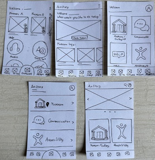
Initial Sketches
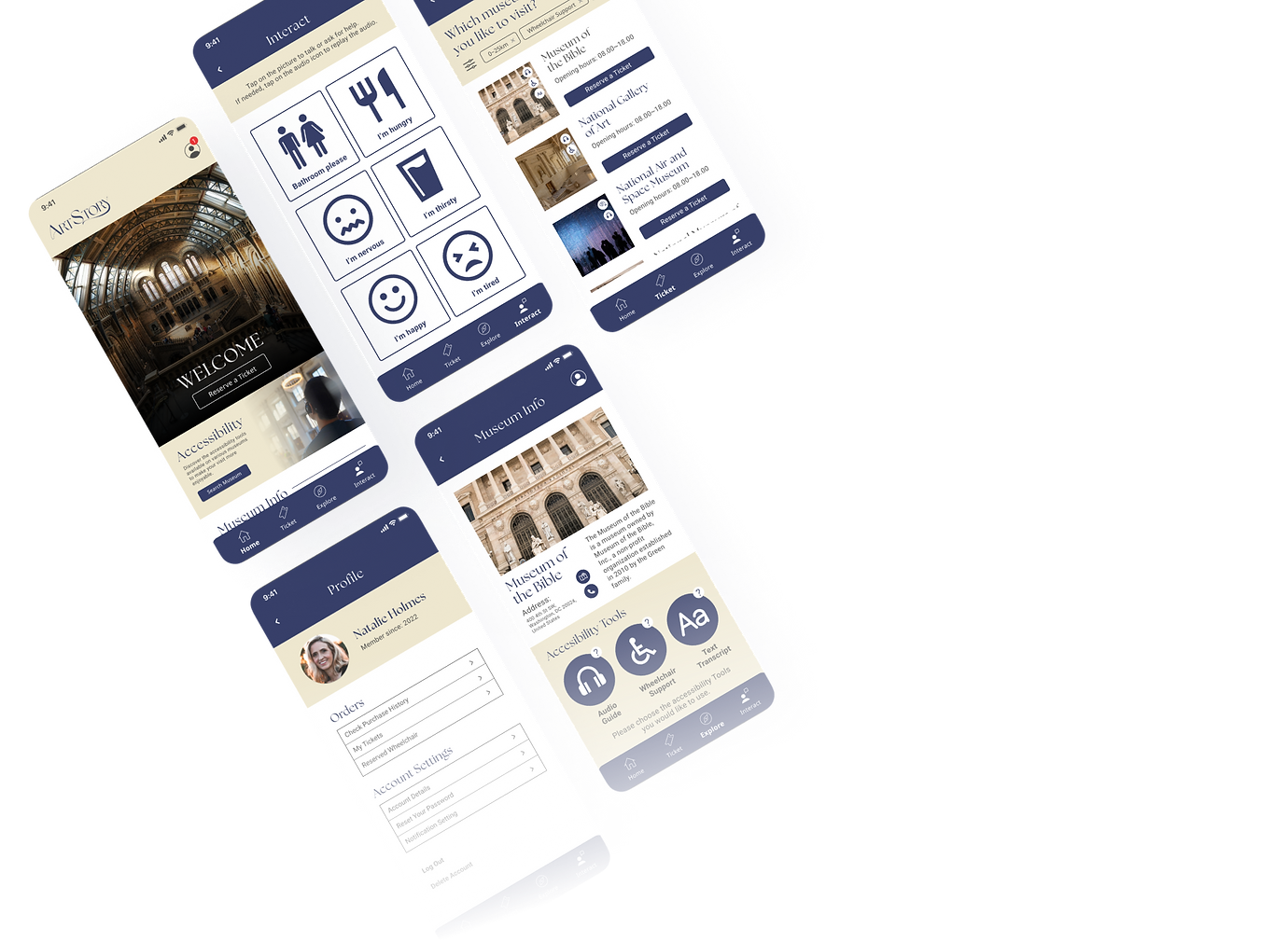
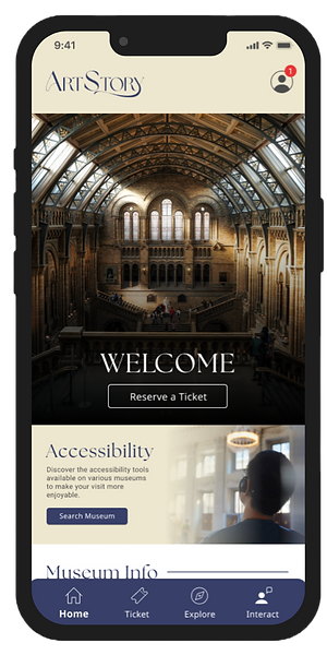
I’m creating 5 alternatives of the landing page for Artstory app. The main idea for the landing page is to have a clean, to-the-point access for booking ticket, access to museum info (news/blog) and a complete navigation bar. The chosen design is the middle one on the first row.

Wireframe
Using Figma, I translated my first sketches into low-fidelity wireframes. At this stage, the wireframes were defined enough for some user testing. Based on usability tests with 7 participants, I’ve made a few iteration and moved on to creating high-fidelity prototypes
User Flow
After creating the wireframe, I created the user flow for the user to access the accessibility tools.

Usability Study
To make sure the apps align with the main purpose and are user-friendly, we conducted two usability studies, each for a low-fidelity prototype and a high-fidelity prototype. Based on the insights from the studies, we discover a few findings to address.
Round 1 findings
-
Unable to find the accessibility tools as intended
-
Users were unable to differentiate the ticket and museum menus at a glance and often clicked the wrong menu.
-
Not understand what the interact button is for
Round 2 findings
-
Need notifications to help users locate their purchased ticket
-
Need thumbnails and archives to help users navigate other news
Solution:
-
We created an additional button on the home page that linked straight to the accessibility pages.
-
Changing the copywriting for the ticket and museum menu to make user easier to differentiate.
-
Adding an explanation on the interact menu so people can understand the purpose.
-
Adding notifications sign-on profile menu to inform users of any purchased ticket.
-
Creating additional thumbnails for each news page.
We have iterated two times based on the feedback of the participants and 80% of the final study participants agree that they find this app easier to use and would like to use this app in longer term especially if the museum contents and info are more comprehensive.

Before and after usability study
Mock Up
Once the usability issues were resolved, I moved on to design the mock up in Figma. Since this is a new app with no brand guide, I created the brand guide myself, including creating icons, logo, and any additional elements. As reference, I’ve checked the competition and various design related to museum/gallery to make sure the design fit.
The navy blue color and the complementary beige color are used to create a warm yet grandeur image of history. The app was created to work on iOS platform, specifically iPhone series, but in the future this app will be available in Android platform too.

Iterate User Flow
After the second usability study, I revamped the userflow to make it easier for user to navigate.

Accessibility Consideration

01
Using colors with appropriate contrast level to help people with difficulties to differentiate it.

02
Since this app focusing on how to make people with disabilities able to enjoy the visit, it promotes museum with accessibility tools that can be used when visiting, like audio guide, wheelchair reservation, and text transcript that can be customized.
03
Clear Call-to-Action (CTA)button to make sure people can continue the user flow easily. Also emphasizes the use of icons to help people with color blindness so they can distinguish the feature more easier.
Learnings
Through the Google UX Design Professional Certificate course and this project, I learned about how apps can have a positive impact on other people by problem-solving. I also learned to not hang on own perceptions and biases when creating an app to make a better app for all users. While creating the app, I also picked up a few skills and tricks, especially regarding creating connections and interaction for the pages.
"Empathy is the strongest asset that a UX Designer can have."
These words that I heard from one of the lecturers of the courses, made me believe that being a UX Designer is something that aligns with my own skill and character. I would love to dive deeper into UX Design and utilize my characteristics, especially in empathy, to create a better product that can solve more problems for many users.